


Subscribe our Weekly Newsletter
RFP - Interactive Data Visualization Webpage
Organization: GBL
Apply By: 08 Aug 2025
About the Organization
We are GBL. We are a global NGO committed to sustainably improving the lives of the world’s workforces. We believe that high quality, formal-sector jobs are the surest way to amplify lifelong economic empowerment and secure, healthy livelihoods. And we believe that employers who invest in their people are more profitable.
From research to evidence to on-ground impact, we are partnering with companies across the Global South and working towards a more secure future for a billion low-income workers worldwide.
About the Proposal
We are seeking proposals from qualied web development rms or individual contractors to build a compelling, interactive, and narrative-driven webpage. This project aims to translate a rich, proprietary dataset into an accessible and human-centered digital experience. The core objective is to move beyond static reports by creating an engaging plaorm that features dynamic data visualizations and powerful narratives. This will allow us to illuminate complex paerns and trends within the data for a broad audience, including analysts, stakeholders, and the general public.
Project Scope:
The project requires the development of a webpage with two primary, interlinked components. We are looking for developers with demonstrated expertise in bringing data to life through sophisticated front-end development.
Part A: Narrative-Driven Data Stories:
This section will form the heart of the webpage, weaving quantitative data and qualitative insights into compelling stories. The goal is to guide the user through a narrative journey using representative data archetypes.
● Core Capability: The ability to build immersive data storytelling experiences where user progression (e.g., scrolling) triggers animations and updates to data visualizations.
● Key Functionalities Required:
- Data-Driven Animation: Develop a central, animated graphic that visualizes the uctuation of key metrics over a representative period. This animation must be directly driven by a time-series dataset.
- Synchronized Visualizations: Create an interactive timeline graph that charts data points, animating in perfect sync with the central graphic and narrative cues.
- Dynamic Event Indicators: Implement clear visual cues (such as icons, color changes, or labels) to represent major data-driven events as they occur on the timeline.
- Summary Data Graphics: At the conclusion of each narrative, generate a summary visualization (e.g., a Sankey diagram or similar ow chart) that programmatically illustrates the breakdown of aggregate data ows.
- Contextual Narrative Display: Seamlessly integrate text-based anecdotes and insights that appear at relevant points within the visual story.
Part B: Interactive Data Dashboard:
This section will provide users with an exploratory tool to engage directly with the aggregated, anonymized dataset. We are seeking a solution that is either a seamless, styled integration of an existing dashboard or a fully custom build.
● Core Capability: The ability to build a robust, multi-faceted data dashboard with interdependent lters and comparison tools.
● Key Functionalities Required:
- Comprehensive Charting: Implement a suite of standard data visualizations (e.g., time-series, bar/pie charts) to display key trends from the full dataset.
- Advanced Filtering System: All charts must be lterable by multiple categorical and temporal variables. Filters must work in concert, allowing for complex queries.
- Data Aggregation: Enable users to change the temporal aggregation of the data (e.g., daily, weekly, monthly) on the fly.
- Comparison Views: Develop a feature that allows users to select and display side-by-side comparisons of dierent data segments.
Technical & Design Requirements:
- The developer will collaborate with our internal design team and will be responsible for implementing a provided style guide and design mockups (e.g., Figma les).
- Our primary website is built on WordPress. Proposals should describe the proposed approach for integrating this interactive webpage into a WordPress environment.
- The webpage must be fully responsive and optimized for desktop, tablet, and mobile devices.
- All visualizations and animations must be smooth, performant, and intuitive, even with complex data.
- The nal code must be well-documented, clean, and maintainable.
- The solution should be built using modern web technologies. Proposals must specify the proposed libraries/frameworks (e.g., D3.js, React, Vue.js) and justify their selection.
How to Apply
Interested parties should submit a proposal that includes the following:
- Porolio: Please provide links to at least 2-3 live examples of relevant work, particularly interactive data visualizations, scrollytelling, or complex dashboards.
- Proposed Timeline: A project plan with key milestones and a nal delivery date. The ideal completion timeframe for this project is 1.5-2 months.
- Quotation: A clear and comprehensive cost for the completion of the project.
Please submit your complete proposal in PDF format via email to marketing@goodbusinesslab.org with the subject line "Proposal: Interactive Data Visualization Webpage". The deadline for submission is August 8, 2025. We look forward to receiving your proposals.
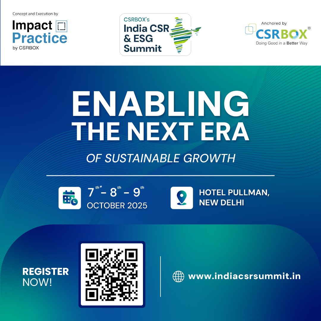
Join us for the 12th Edition of India CSR & ESG Summit 2025 | Register Now

Latest Online Store
Latest Grants
Latest News


© Renalysis Consultants Pvt Ltd